Abram Games: posters of ‘maximum meaning, minimum means’
Introduction
Born in Whitechapel in London in 1914, Abram Games was among the most influential poster designers of his generation.
While Games briefly attended St Martin’s School of Art and undertook art evening classes, he was largely self-taught. A winning entry in a poster competition in 1935 launched him into a freelance career, including his first London Transport (LT) poster commission in 1937.

During the Second World War, Games briefly served in the Army before being transferred to the War Office. In 1942, he was appointed as ‘official war poster artist’, designing around 100 posters promoting the war effort, many of which became widely known.
In peacetime, Games designed posters for a range of clients, adopting a motto of ‘maximum meaning, minimum means’. His work often featured bold colour, strong graphic forms and integrated typography in designs that were attractive and clever. Games designed his last LT poster in 1976. He died in 1996 as one of the most important poster designers of his lifetime.
Here we chart his graphic design career through a selection of his LT posters over time.


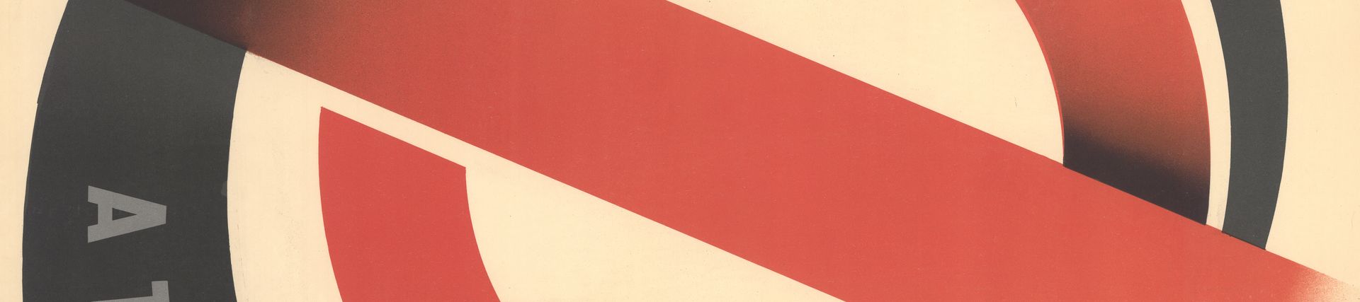
These two posters were among Games’ first LT commissions after the Second World War, sharing a sense of style with some of his wartime work. They typify Games’ work in cleverly using the LT roundel in stylised symbolic figures bowing to echo the ‘at London’s service’ message.

Like many of his poster artworks, Games completed this one in gouache, a water-based paint containing white pigment to make it opaque. This was for a panel poster for LT linked to the Festival of Britain in 1951, for which Games also designed the famous emblem incorporating a stylised Britannia. The artwork particularly highlights his use of a stippling brush to create the textured effects to the gouache in the background of the design.


Pair posters like these gave LT the opportunity to convey more information, usually through one image-based and one text-based sheet. Games’ design cleverly distributes information in columns in both halves.
Despite this being a sizeable design across two sheets, Games first settled on this chosen design by completing a tiny thumbnail sketch. After roughly sketching ideas, Games would generally work up his chosen design in miniature form. This helped him to see if the poster was impactful from a distance. He would then proceed to producing an artwork at larger size, prior to handing over to LT’s chosen printers.

This Games designed poster advertised LT coach tours. Originally Games sketched ideas featuring the rear of a Green Line coach. However, LT Publicity Officer Harold Hutchison offered feedback that ‘the backside of a coach is not something we want people to look at’.
Games went back to the drawing board. His finished poster cleverly combines a suggestion of a Green Line coach, complete with roundel, as the arms of the two figures, who survey the sights of London with glasses and camera.


By the 1960s, Games was an internationally renowned poster designer. He still regularly completed commissions for LT.
‘The City of London’ combines London landmarks into the figure of a Horse Guards trooper astride a horse, complete with Nelson’s Column as a sword. Games, who had Jewish heritage, sometimes incorporated the names of loved ones in Hebrew within his designs. In this one, they are contained in the clock dial of the Elizabeth Tower that forms the horse’s eye.
On a similar theme of seeing London sights by bus and coach, ‘Sightsee London’ features strong tones of pink, red and orange to create a double-decker bus made up of architectural landmarks. These include Buckingham Palace, the Elizabeth Tower housing Big Ben and the dome of St Paul’s Cathedral.

In this LT poster Games uses stylised London landmarks in the shape of letters, and a LT roundel, to spell out ‘Sightsee London on London Transport’. The design very much delivers on Games’ personal motto ‘maximum meaning, minimum means’ and demonstrates his bold use of colour, form and typography.


This was a prime example of how a poster commission could work when an established commissioner was working with a trusted designer. The letter shown here, written by LT Assistant Publicity Officer Michael Levey, gave Games his outline brief for a poster promoting public transport trips to London Zoo. Games then had a month and a half to work up the design.
The resulting poster is typical of Games’ style in cleverly integrating imagery, typography and brand identity in one seamless and impactful design. It was Games’ last LT poster commission, so it is somehow fitting that it is among the most famous and well-loved of his many LT posters.


