London by Design - Five iconic posters from the Museum's collection
I have selected, with great difficulty, a few posters that reflect, for me, the theme ‘London by Design’. Each poster has stopped me in my steps as I have grasped the message; the artist in each design exudes so strong a message that makes any text rather superfluous! Undoubtedly one or more of this selection will be familiar to many.
‘Power’ by Edward McKnight Kauffer, 1931
This Modernist work evokes feelings of power and the desire to travel around the UK’s powerful Capital by using the Underground. Through prominent use of black and red, the power of the Underground is signified by the Underground Group’s own power station at Lots Road, Chelsea. From out of the central roundel, surrounded by the suggestion of a tunnel, charges a muscular arm with fist, suggesting a Tube train, and a lightning bolt which is symbolic of immense power emphasised by the use of vortex, a popular artistic technique at the time. Note that the text, including, ‘Underground’ has been handwritten rather than using the Underground Group’s adopted Johnston typeface and ‘UndergrounD’ logo.

‘London Transport -’ and ‘- Keeps London Going’ by Man Ray, 1938
The sole London Transport commission from the American Surrealist designer and photographer Man Ray. Is there a certain arrogance in the way the Underground is portrayed as the roundel floats in space almost nudging Saturn? The black and white design, which did not meet entirely with the approval of London Transport’s Chief Executive Frank Pick, was produced using a photogram or ‘Rayograph’, a camera-less process, and intended to be hung as a pair. Paired posters were designed to hang either side of, for example, a bench or entrance/exit.


‘Speed underground’ by Alan Rogers, 1930
A Modernist depiction of the fully adopted roundel that had been developed during the 1920s and now incorporated into much poster publicity. This poster is a simple design with just a two-word message; the Underground will get you there quickly. The lightning bolt symbolises electric power, speed and accuracy with the Underground roundel attached to the archer’s quiver. Note the depiction of a Tube train between the archer’s legs.

‘London Zoo’, by Abram Games (1976)
The message to use the Underground to visit London Zoo is publicised through a simple design depicting a tiger and the use of coloured lines and shapes each colour representing an Underground line. Look closely and you’ll see the London Transport logo together with the word ‘Zoo’. A brilliant if simple design, the tiger commanding your attention, with minimal text and best seen from a distance; it is interesting to draw some similarity of style between this poster and ‘Speed underground’ from 46 years earlier.

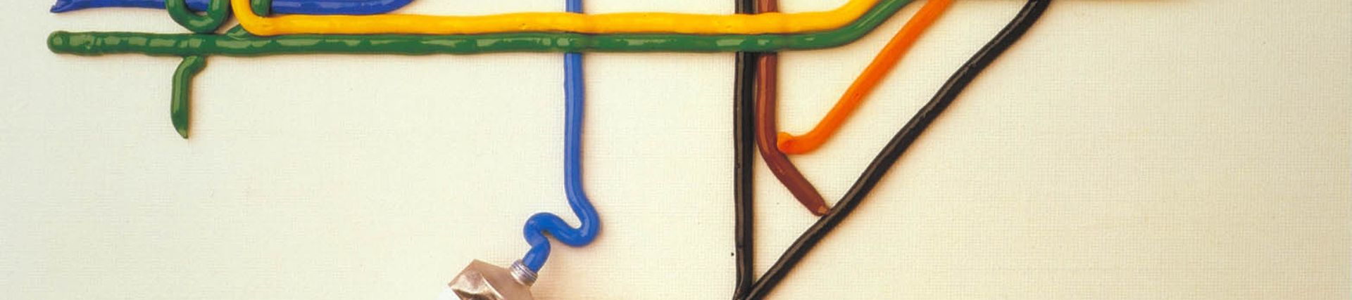
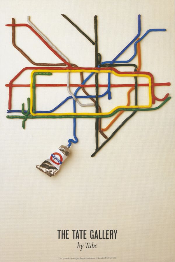
‘The Tate Gallery by Tube’ by David Booth/ Shirtsleeve Studio and Fine White Line, 1987
I had to include this! It was commissioned by London Transport as part of the Art on the Underground series and is a humorous depiction of the Harry Beck Tube map through the use of visual pun, i.e. a paint ‘tube’ and ‘lines’ of colour. The only text is ‘The Tate Gallery’, otherwise the main poster design sells the idea of travelling on the Tube to the Tate and elsewhere in London. Very clever, and surprisingly this idea was never used previously.
You can see these and many other iconic London Transport posters on display in our London by Design gallery on the ground floor, and in the Poster Parade and new digital display on the first floor.
